Shopify Polaris Guide: Components, Icons & Design System

When building apps for Shopify, consistency in design and user experience plays a crucial role. To streamline app development, Shopify launched Shopify Polaris—a comprehensive design system that empowers developers to build applications that are consistent, accessible, and user-friendly. In this blog, we will explore what Shopify Polaris is, how to install and use it, and the role of components, icons, and forms in creating a polished Shopify app experience.
What is Shopify Polaris?
Shopify Polaris is Shopify’s official design system that provides a set of guidelines, principles, and ready-to-use components for developers. It ensures all apps built on Shopify maintain a consistent look and feel, aligned with Shopify’s user experience standards.
By using Polaris, developers save time on UI/UX design while delivering apps that feel native to the Shopify ecosystem.
Is Shopify Polaris Open Source?
Yes, Shopify Polaris is open source. Developers can access its codebase directly on GitHub. This open-source approach allows for community contributions, faster improvements, and complete transparency.
How to Install Shopify Polaris
Installing Shopify Polaris is simple if you are working with React.
Steps to install:
- Open your Shopify app project.
- Run the command
- Import Polaris styles and components into your React project:
- Wrap your app with AppProvider to access Polaris components.
npm install @shopify/polaris
import '@shopify/polaris/build/esm/styles.css';

import {AppProvider, Button} from '@shopify/polaris';

How to Use Shopify Polaris
Once installed, using Polaris is straightforward. Developers can leverage pre-built components like buttons, forms, navigation menus, modals, and icons to create a cohesive Shopify app UI.
For example, creating a button is as simple as:
<Button onClick={() => console.log('Clicked!')}>Click Me</Button>
Polaris ensures that all components are accessible, responsive, and visually consistent with Shopify’s interface.
Already have a store but need expert help? Schedule a free consultation with our Shopify experts and see how we can align your design with better conversions.
Shopify Polaris Components
The Shopify Polaris components are the foundation of Shopify’s design system. These pre-built UI elements allow developers to create feature-rich, accessible, and consistent applications without reinventing the wheel. By leveraging Polaris components, developers can focus more on app functionality while maintaining a professional look and feel that seamlessly integrates into Shopify’s ecosystem.
Key Shopify Polaris Components
- Buttons: Buttons are one of the most frequently used elements in Shopify apps. Polaris provides multiple button variations to cover different scenarios:
- Cards: Cards are used for grouping related information into structured blocks. They are highly flexible and can contain text, forms, images, or actions. For example, product details can be displayed inside a card with editing options
- Modals: Modals provide a focused interface for important tasks such as confirmations, warnings, or forms. They help reduce clutter by keeping merchants in context without navigating to another page.
- Navigation: Navigation components make it easy to structure menus and app layouts. They ensure consistency with the Shopify admin, so merchants can quickly understand how to move through your app.
Primary Buttons – Highlight the main action on a page (e.g., “Save”).
Secondary Buttons – Used for less prominent actions (e.g., “Cancel”).
Destructive Buttons – Indicate actions that delete or remove data (e.g., “Delete Product”).
Example:
<Card title="Product Details" sectioned>

  <p>Manage product name, description, and pricing here.</p>

</Card>
Example:
<Modal

  open={active}

  onClose={handleChange}

  title="Delete product?"

  primaryAction={{

    content: 'Delete',

    destructive: true,

    onAction: handleDelete,

  }}

  secondaryActions={[

    {

      content: 'Cancel',

      onAction: handleChange,

    },

  ]}>

 <Modal.Section>

   <TextContainer>

      <p>This action will delete the product. Do you want to proceed? </p>

    </TextContainer>

   </Modal.Section>

 </Modal>
Example:
<Navigation location="/">

  <Navigation.Section

    items={[

      {label: 'Home', url: '/'},

      {label: 'Orders', url: '/orders'},

      {label: 'Products', url: '/products'},

    ]}

  />

</Navigation>
Why Shopify Polaris Components Matter
- Consistency: Applications mirror the look and feel of Shopify’s native admin, ensuring a familiar and intuitive experience for merchants.
- Accessibility: Components come pre-built with accessibility features such as ARIA labels and keyboard navigation.
- Faster Development: Developers save significant time by reusing these ready-made building blocks.
- Scalability: Components are responsive and work seamlessly across desktop, tablet, and mobile screens.
By utilizing Shopify Polaris components, developers can speed up their development cycles, reduce UI/UX inconsistencies, and deliver high-quality apps that feel like a natural extension of Shopify.
Shopify Polaris ensures design consistency, and it’s widely used by teams offering Shopify development services for custom store and app builds.
Shopify Polaris Icons
The Shopify Polaris icons library includes a wide range of symbols for navigation, actions, and status indicators. Developers can easily integrate them into apps to improve usability and design consistency.
Example usage:
import {HomeIcon} from '@shopify/polaris-icons';
Icons follow Shopify’s visual guidelines, ensuring apps look polished and intuitive.
Shopify Polaris Form Components
Forms are one of the most essential elements of any Shopify application. Merchants rely on them for critical tasks like entering product details, managing orders, and collecting customer information. A poorly designed form can frustrate users, but with Shopify Polaris form components, developers can build intuitive, accessible, and consistent forms that enhance the overall merchant experience.
Key Form Components in Shopify Polaris
- Text Fields: Used for inputting information such as product names, prices, or customer details. Polaris text fields support labels, placeholders, and validation messages to make data entry clear and accessible.
- Dropdowns: Ideal for selecting from a predefined list, such as product categories, shipping methods, or payment options. Polaris dropdowns are styled for consistency and optimized for both desktop and mobile devices.
- Radio Buttons: Allow merchants to select one option from a set of choices For example, selecting a product status like “Draft” or “Published.” Radio buttons in Polaris are designed with accessibility in mind, ensuring clarity for all users.
- Checkboxes: Useful for multiple selections, such as enabling extra product features, selecting multiple customer notifications, or applying bulk actions. Polaris checkboxes follow Shopify’s visual standards for consistency.
- Validation Messages: Error handling and validation are critical in form usability. Polaris form components include inline validation messages, guiding users to fix errors quickly without disrupting workflow.
By using these Polaris form components, developers reduce design inconsistencies, save time, and deliver forms that feel natural within the Shopify admin experience.

Shopify Polaris Design System
The Shopify Polaris design system goes beyond a simple UI library—it provides a complete framework of principles and guidelines that guarantee every Shopify app offers a consistent and familiar experience.
Core Principles of the Design System
- Consistency: Every app built with Polaris aligns with Shopify’s overall interface. This consistency reduces the learning curve for merchants, who can instantly understand how to navigate and use new apps.
- Accessibility: Polaris emphasizes inclusivity, making sure apps are usable by people with different abilities. All components follow WCAG standards, ensuring proper color contrast, keyboard navigation, and screen reader compatibility.
- Scalability: Apps must perform well across devices and screen sizes. Polaris components are responsive by default, adapting seamlessly to desktops, tablets, and mobile devices.
Why the Design System Matters
The Shopify Polaris design system helps developers deliver apps that are both merchant-friendly and future-proof. Instead of reinventing the wheel, developers can rely on a proven system, reducing errors and creating a unified experience across the Shopify ecosystem.
Advantages of Using Shopify Polaris
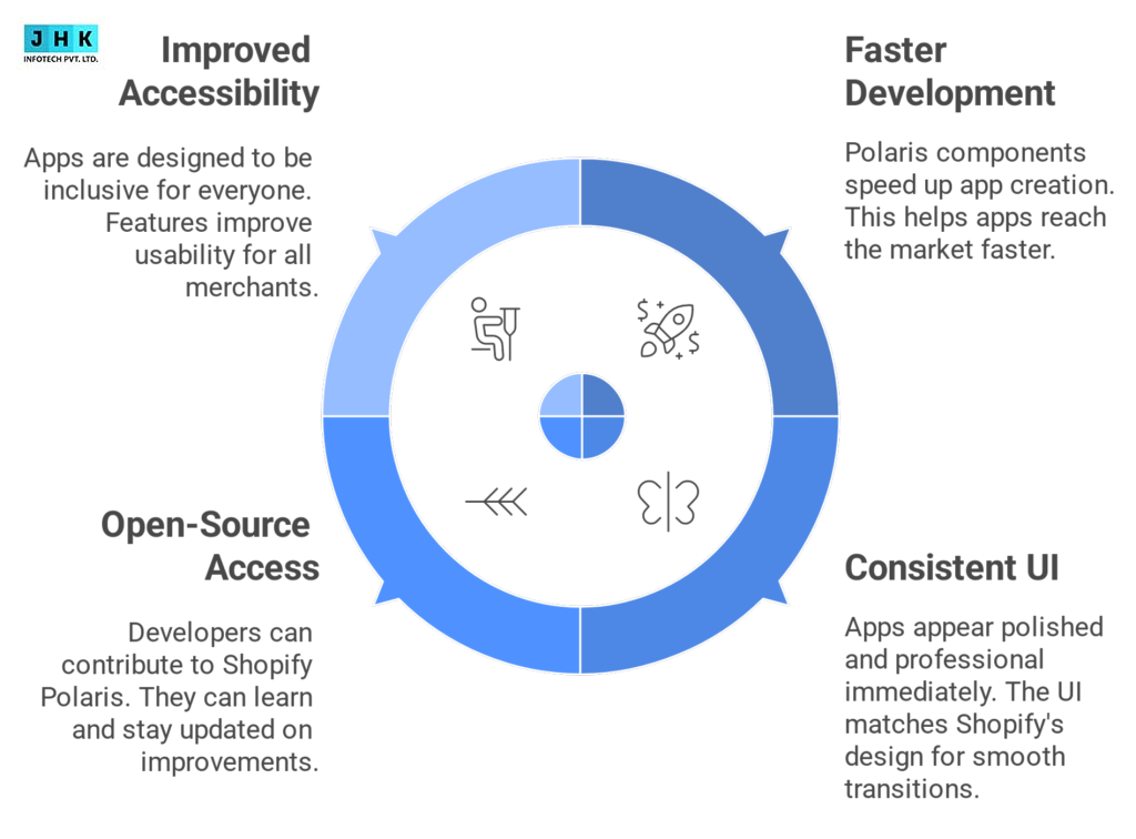
- Faster App Development: Developers can skip building UI elements from scratch. Pre-built Polaris components accelerate the development cycle, helping apps go to market quickly.
- Professional and Consistent UI: Apps built with Polaris instantly look polished and professional. Since the UI mirrors Shopify’s native design, merchants experience a seamless transition between the Shopify admin and third-party apps.
- Open-Source Access and Community Support: Shopify Polaris is open source, hosted on GitHub. This allows developers to contribute, learn from others, and stay updated with the latest improvements in the system.
- Improved Accessibility and Merchant Experience: With Polaris, apps are designed for everyone. Accessibility features such as keyboard navigation and proper semantic markup improve usability, ensuring merchants can work without barriers.
In short, Polaris is not just a convenience for developers—it’s a tool that drives better merchant adoption and satisfaction.
Limitations of Shopify Polaris
While Shopify Polaris is powerful, it does come with a few limitations that developers should keep in mind:
- Requires React Knowledge: Shopify Polaris is built primarily for React. Developers new to React may encounter a learning curve before they can fully utilize Shopify Polaris.
- Customization Limitations: Since Polaris follows Shopify’s strict design guidelines, customization options can feel limited. Developers looking for highly unique branding or completely custom UIs may find Polaris restrictive.
- Dependency on Shopify’s Updates: Polaris evolves alongside Shopify. This means developers need to stay updated with new releases and breaking changes, which may require app updates to maintain compatibility.
Despite these limitations, the advantages far outweigh the drawbacks for most developers, especially those building apps designed to integrate seamlessly into the Shopify ecosystem.
Conclusion
Shopify Polaris is more than just a UI library—it is a design system that ensures Shopify apps deliver a seamless, consistent, and professional user experience. From components and icons to forms and accessibility, Polaris empowers developers to build apps faster and better.
FAQ’s
1. Is Polaris still in business?
Yes, Shopify Polaris is very much active and maintained. It is continuously updated as Shopify’s official design system. Polaris is regularly updated by Shopify and its open-source community on GitHub, ensuring developers always have access to modern components, accessibility improvements, and design updates that align with the Shopify ecosystem.
2. What is special about Polaris?
The unique aspect of Shopify Polaris is its ability to deliver consistency, accessibility, and efficiency in app development. Unlike generic UI libraries, Polaris is purpose-built for Shopify apps, meaning every component—whether it’s a button, card, or form—is designed to integrate seamlessly with the Shopify admin interface. This makes apps easier for merchants to use and faster for developers to build.
3. Shopify Polaris Resource List
Shopify Polaris provides a Resource List component that allows developers to display items such as products, customers, or orders in an organized, accessible format. Resource lists can include text, images, actions, and links for quick navigation. This makes it easier for merchants to scan through data, perform bulk actions, and manage large amounts of information in a structured way.
4. Shopify vs Shopify Plus Features
- Shopify: Best for small to medium businesses. Includes core e-commerce features such as product management, orders, payments, shipping, and apps.
- Shopify Plus: Tailored for enterprise-level businesses. Offers advanced features such as higher API limits, dedicated support, customizable checkout, automation tools (Shopify Flow), and enhanced scalability.
In short, Shopify is perfect for growing merchants, while Shopify Plus is designed for high-volume, large-scale operations.
5. What’s Your Biggest Challenge When Using Shopify Polaris in Your Designs?
The most common challenge when using Shopify Polaris is the learning curve with React and the limitations in customization. Since Polaris is designed to follow strict Shopify guidelines, developers sometimes find it restrictive when they want highly unique branding or design variations. However, these limitations are outweighed by the advantages—such as faster development, accessibility compliance, and consistent UI—making Polaris a go-to framework for Shopify app developers.
Recent Post
-

-

February 26, 2026
AI Trends 2026: Latest AI Innovation, Developments & Predictions
-

February 23, 2026
Hyper-Personalization in Marketing: Examples, AI & Benefits
-

February 6, 2026
Search and Type URL: What It Means, How It Works, and Why It Appears
-

January 13, 2026
Does Linking to Other Websites Help SEO? Explained in Detail